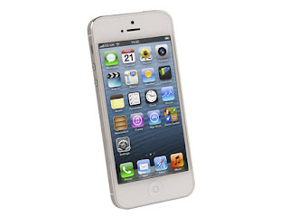
 Statistics has shown until mid 2012, a total of 17% of searched pages (websites/blogs) through major search engines like Google, MSN, Yahoo (Bing) are accessed via smartphones just like iPhone 5. And the figures will increase and is estimated to reach the 30% mark by early next year and more than 60% mark by end of 2013. So, it is really time for you to consider in upgrading your blog or website for mobility use as the figures will increase tremendously.
How can you make your web pages mobile friendly? Well, there are many information and resources that will help you in "transforming" your web pages iPhone 5/smartphone friendly. For bloggers like me on blogger platform, we have the mobile theme switch through: blogger > Templates > Mobile > Select Theme > Your Done! Simple, yet well taken to consideration by blogger developers. Important note - make sure you select and test the many available mobile blogger themes before making the final decision.
But for other blog-ing and websites platforms like Wordpress, concrete5, Joomla. Drupal, to name a few, its about time to configure/upgrade your websites/blogs for smartphone/ipads screens, usability and functionality. You can either choose mobile friendly themes and templates, which I'm sure there are tonnes in the market, or "transform" your existing themes and templates with fluid and responsive design layout. Some are easy, and there are some which really take time and effort. So choose wisely, Google around, find relevant resources and techniques which are shared by professionals in the industry.
Here's and example of a fluid grid layout for reference by fluid960gs. It has been developed and maintained for years and due to its screen flexibility and cross browser capabilities, it is highly recommended by major CMS developers ie. concrete5 - and there's a free add on theme for concrete5 users too! So, by switching your website/blog structured layout, you will get the best for both world - mobile aka smartphones and different screen resolutions ie laptop and PC widescreens. What users see your website/blog on PC screens, will definitely have the same features in any small smartphones, just like your Apple iPhones.
"Gadget Impian" means your dream gadget/smartphone. "iPhone 5 Gadget Impian" can be yours as Malaysian bloggers participate in a friendly SEO contest in winning the coveted prize - Yes a brand new out of the box Apple iPhone 5 smartphone for grabs! Hosted by Denaihati Networks and friends, it will be a memorable event until end of 2012, as to date, searched keyword for "iPhone 5 Gadget Impian" has reached the 1 million results mark.
Type in the magic keyword "iPhone 5 Gadget Impian" and read through the many articles produced by amazing blog writers and owners. Or you could browse through denaihati.com (in Bahasa Melayu) and find out current updates and challenges that these fine contestants have to face in their endeavour to clinch the grand prize - the Apple iPhone 5. Dream gadget for Malaysian bloggers to win!
iPhone 5 Gadget Impian Kills Bloggers
Reviewed by Zuraini Ariffin on Nov 29 2012
Why and how to convert your blogger/website mobile friendly for smart phones such as iPhones, the user usage changes today. Rating:
Reviewed by Zuraini Ariffin on Nov 29 2012
Why and how to convert your blogger/website mobile friendly for smart phones such as iPhones, the user usage changes today. Rating:


